Back 


Newsletter Sign Up Form
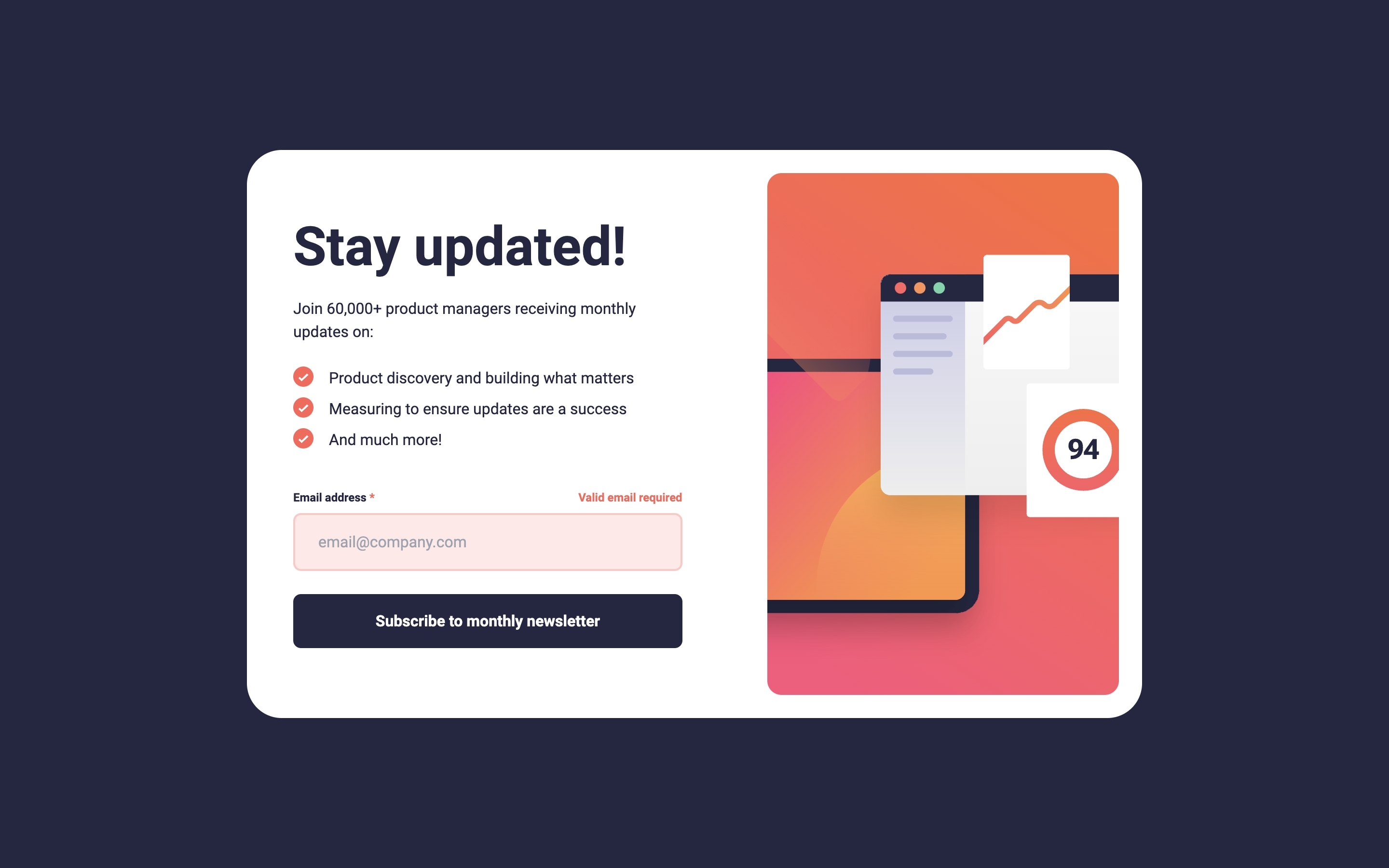
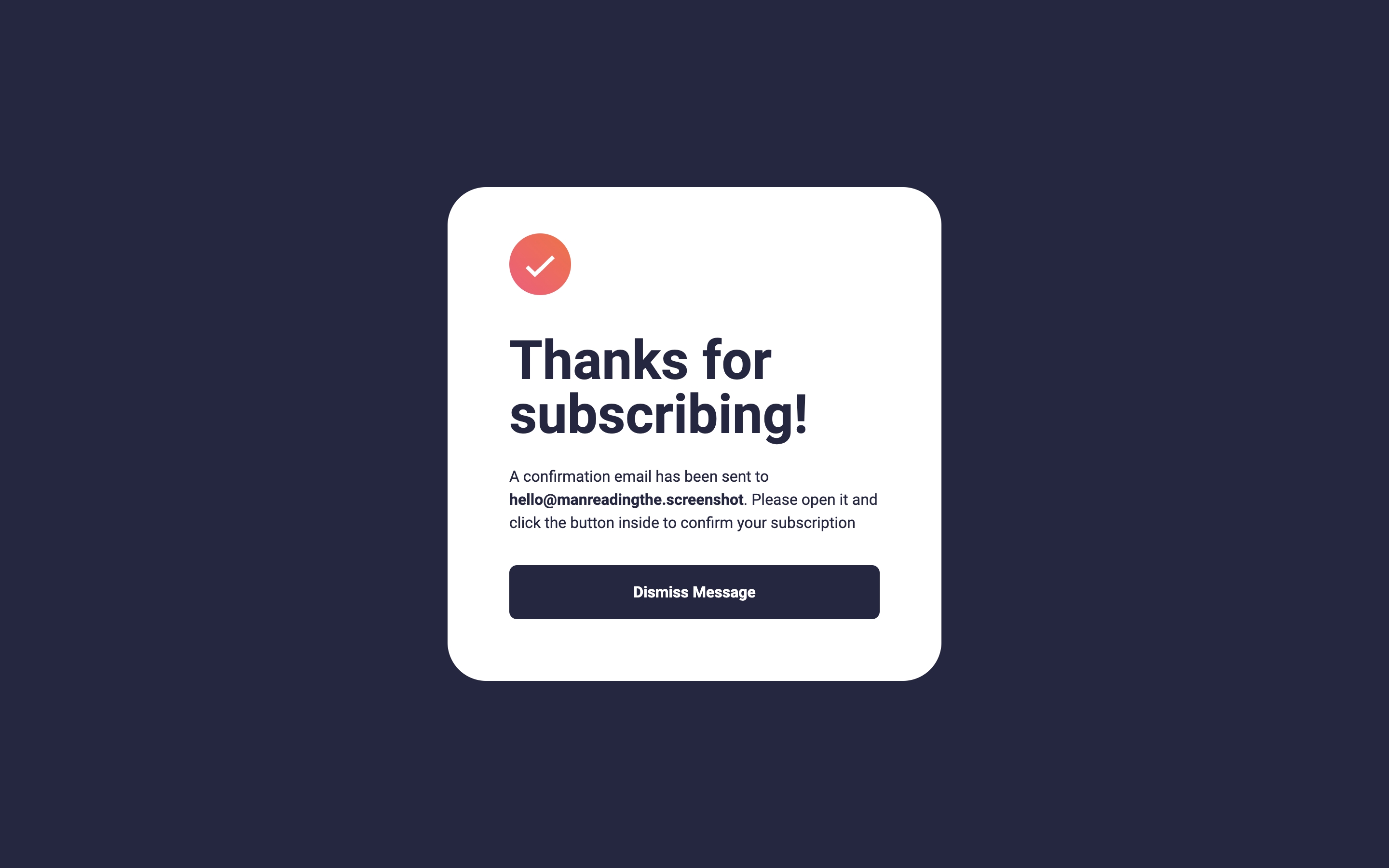
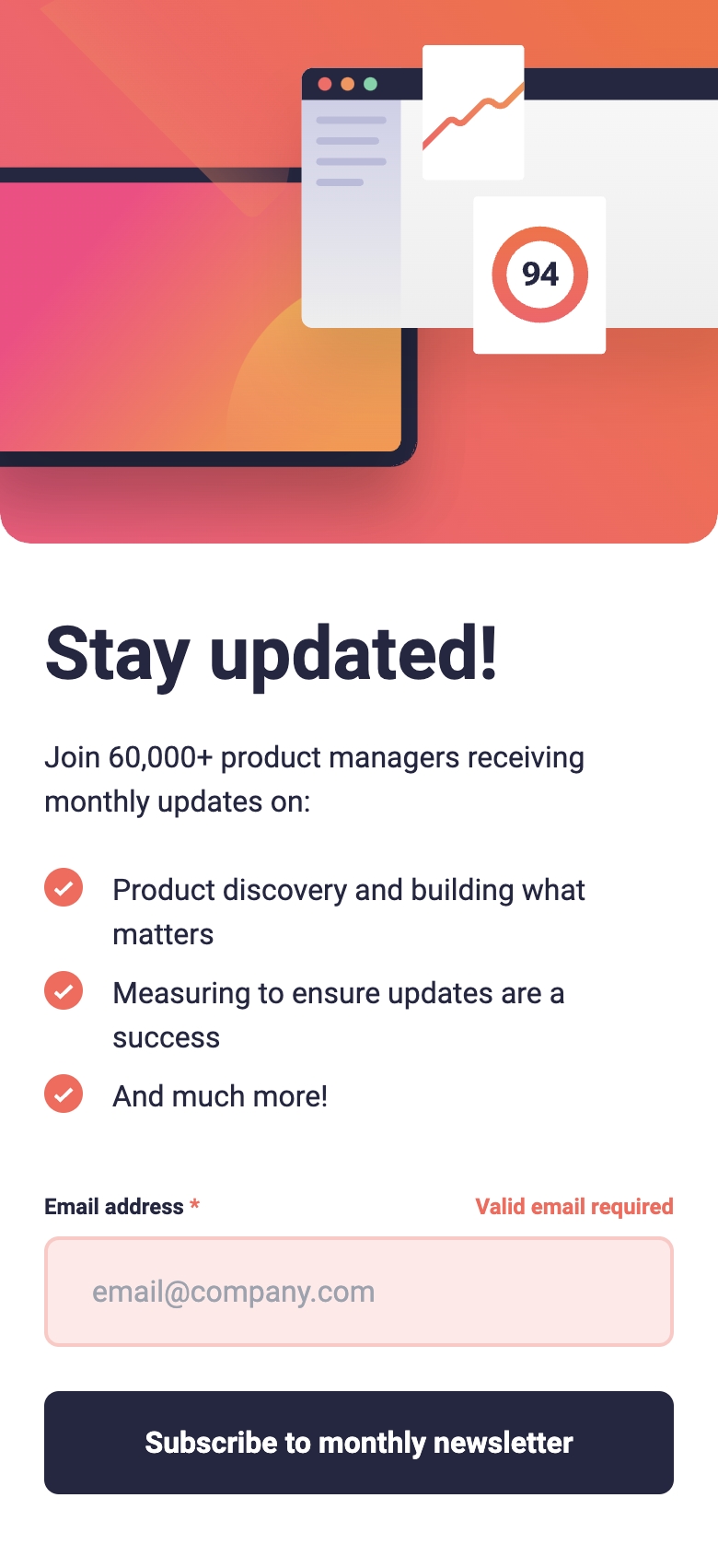
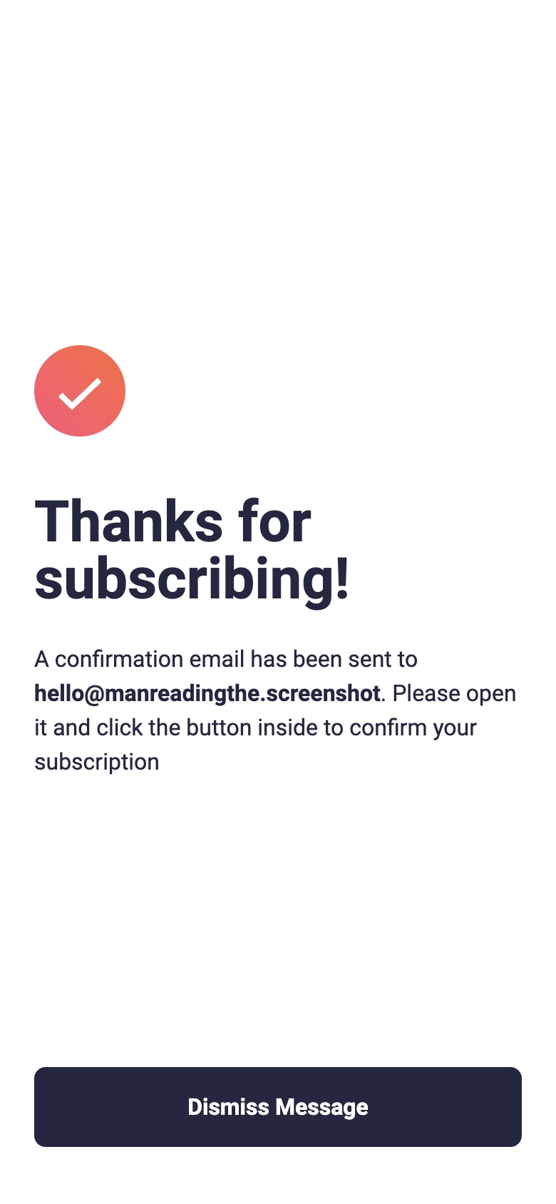
A signup form for a fake newsletter service, with error and success modals differently on mobile compared to desktop, challenge by Frontend Mentor.
Links
Media
Desktop
Desktop Active
Mobile
Mobile Active
The challenge
Users should be able to:
- Add their email and submit the form
- See a success message with their email after successfully submitting the form
- See form validation messages if:
- The field is left empty
- The email address is not formatted correctly
- View the optimal layout for the interface depending on their device’s screen size
- See hover and focus states for all interactive elements on the page
What I learned
- Styling bullet points with
background-imagegives more control over styling withlist-style-typeandlist-style-positionor::marker. - No way to have a
<picture>equivalence for<svg>apparently, and default to usingimgtag for SVGs. Not as fast as using inline SVGs, but still great to use media queries with.
Continued development
I took a bit too long with the responsive design. I need a lot of practice here.
Useful resources
- Styling list - MDN Docs - Helped with styling
<ul>and<li>elements. - Flexbox Order - Ordering flex items.